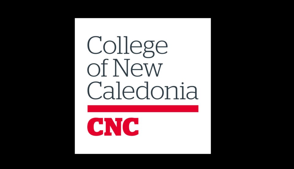
There's a new logo for a Prince George college.
The College of New Caledonia (CNC) has updated their logo, which they say is modern and reflective of deep connections the college has had to its communities for close to half a century.
“Our brand is who we are,” CNC President Henry Reiser says in a news release. “It’s what distinguishes us from others. It permeates our decisions and affects our service delivery. ‘The College of New’ – a place where the brand is as diverse as the communities we serve, the students who learn here, and the people who dedicate themselves to seeing others succeed.”
Our new CNC logo is the centerpiece of our visual identity. A bold, contemporary wordmark that embraces our heritage through colour, while its mixed case font feels human and approachable and speaks to our unique and distinctive character. #mycnc https://t.co/Cex1Q6Iprt pic.twitter.com/7E0fXMasRm
— College of New Caledonia (CNC) (@cnc_bc_ca) March 1, 2019
The project, titled "Characterizing CNC" launched in Nov. of 2017, where Léger Marketing was hired to research its brand and found a disconnection between the CNC reputation and its visual identity.
Interviews were conducted along with collaborative workshops, feedback sessions and steering committees which included hundreds of current and prospective students, employees, instructors, alumni, donors, partners, and stakeholders.
“This project was truly a team effort encompassing all facets of the CNC community,” Alyson Gourley-Cramer, CNC Executive Director of Communications adds in the release. "As a result, it genuinely captures the essence of who we are and where we have the potential to go as an institution.”
A bar is the main component in the middle, which the college says is a unique, simple graphic element of the new logo which represents one of their main brand qualities which is connection.
"It is the bridge between learners and educators, inspiring movement forward, connecting people to potential," the release states.
The Bar in our logo is at the core of our visual identity. It reflects our connective nature, a bridge between learners and educators, inspiring movement forward, connecting people to potential. #mycnchttps://t.co/Cex1Q6Iprt pic.twitter.com/SMliHrntww
— College of New Caledonia (CNC) (@cnc_bc_ca) March 1, 2019
Red was chosen as a subtle reference to the 21 Aboriginal communities that the college serves.
The new logo and visual identity are in anticipation of the college's 50th anniversary this coming September.
"Taking on a project like this takes commitment and determination to ensure consultation and collaboration occur,” says CNC Board Chair Gil Malfair. “The Board has participated and supported the College throughout this process and we are pleased with the result."


