The royal navy returns after a 15-year hiatus from Prince George.
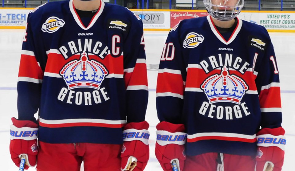
The Spruce Kings recently unveiled its latest of what has been many alternate jerseys during its time in the northern capital and it’s brought back a sharp look with a beloved past.
In keeping up with the Reverse Retro trend the NHL began before the puck dropped on its shortened 2020-21 season, the team decided to finally take the navy blue, red stripe, big bold font letters out of storage, where it was sitting for many months.
That’s according to Spruce Kings General Manager Mike Hawes, who also had his contract extended three more years this month and has seen a lot of jersey concepts in his tenure.
“We actually had this designed and produced, and in our storage space at the RMCA well before the NHL even had ideas of going with the reverse retro jerseys they designed for this season. Not saying that we beat them to the punch, but we did beat them to the punch,” explained Hawes in an interview with PrinceGeorgeMatters with a slight chuckle.
“Once I get an idea in my head, I work with Bauer, who is the equipment supplier for the BCHL, so I work with the Bauer sales rep and their design team and we go back and forth with some ideas. They send me samples of some jerseys, then we tweak it as we go along until we come up with what we decide is the best looking one and then we move forward with producing that jersey.”
On Feb. 4, Prince George's junior ‘A’ hockey club went public with its own reverse retro.
PrinceGeorgeMatters’ discussion with Hawes dove into some of the history.
BEFORE THE 2007 ROYAL BANK CUP
The last time we saw navy blue on a Spruce Kings sweater was in 2006, a year prior to the team’s first-ever run to the national championship, known back then as the RBC Royal Bank Cup.
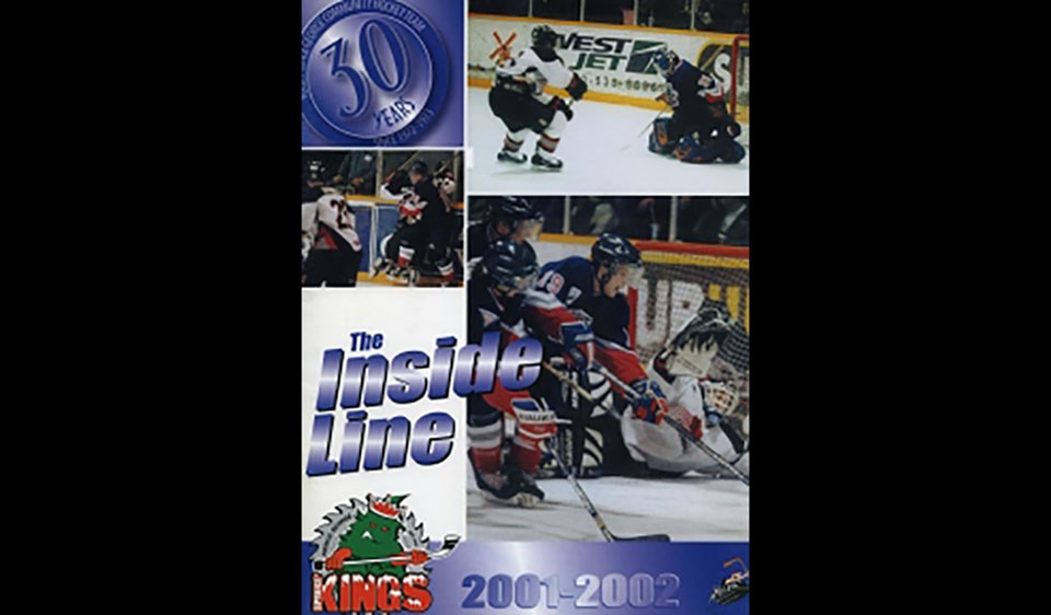
For several seasons, the team donned an early 2000s New York Rangers theme while on the road with the navy blue base, some silver and white trim and red on the forearms.
The logo at the time was the angry tree with the buzzsaw around it, but was then changed in the year of hosting duties.
“The organization had decided to revert back to our crown logo and more of the original design,” said Hawes, who’s also grown very fond of the current look.
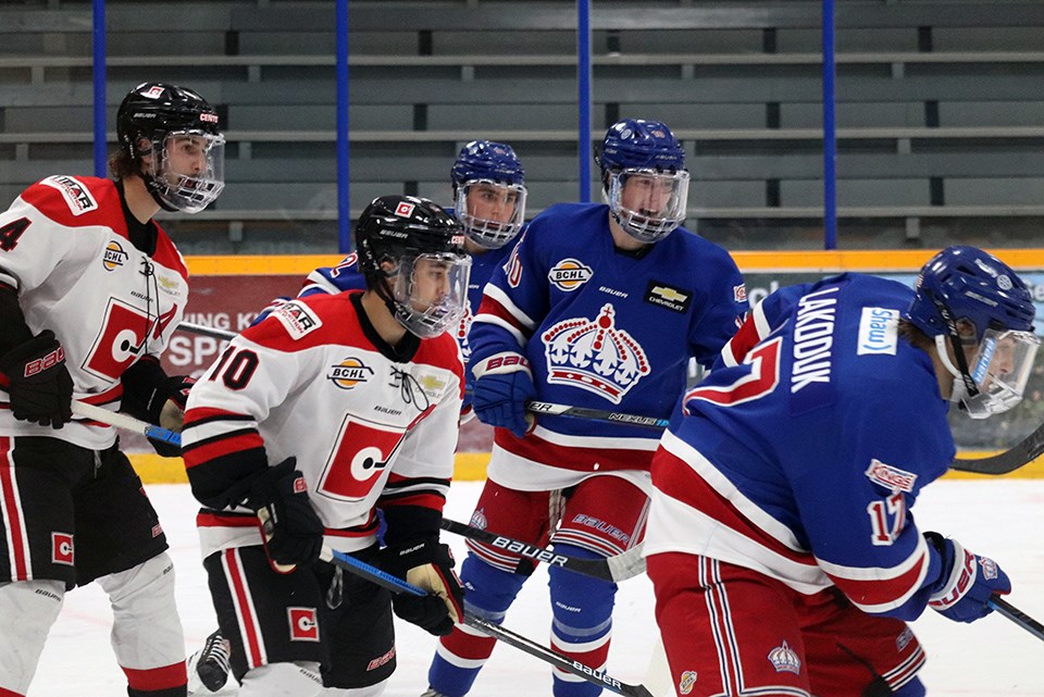
“So we went strictly with the Rangers’ look that we brought back for that season and that’s what we wore for the national championship. The only difference is that we had the Rangers’ design, but we actually use the Montreal Canadiens blue. It’s a bit brighter blue than what the Rangers’ use, so the Rangers’ blue with a royal Montreal Canadien blue is the concept we decided to go with right before the Royal Bank Cup that year and that’s the one we’re still currently using. I really like them. I don’t see us changing that design at any point especially while I’m here.”
 Prince George Spruce Kings program for the 2001-02 season featuring the navy blue spruce tree road sweaters. By Hockey DB/Edited by Kyle Balzer, PrinceGeorgeMatters
In the process of coming up with a design like the reverse retro, Hawes says he likes to go old school and pay tribute to the original six NHL clubs.
In 2019-20, the season after the Spruce Kings’ run to the Fred Page and Doyle Cups, the team revealed a red and white striped sweater that resembled the Detroit Red Wings colours.
It became very popular, Hawes remarked, but now with the navy blue, the latest jersey’s overall look was inspired by the Montreal Canadiens and its design.
“They’re more of a royal blue, we decided to go back to a navy, which is a colour the Spruce Kings wore about 15 years ago, so I want to incorporate that and just kind of an original old-school hockey feel, but with something that popped. We changed the font and the lettering that we changed a little bit and it jumped out.”
FAN REACTIONS
The Spruce Kings reverse retro became a hit when the team revealed the look on social media, garnering 1,000 views on Instagram alone.
Comments of the new unis were ‘slick,’ ‘awesome’ and ‘instant classic,’ much to the delight of Hawes and his front office staff, explaining the fans were the very reason why they decided to roll it out.
“Our fans have been very resilient and our players have been resilient, our staff has persevered through this tough time until this point, so just to give our fans something to be excited about. I know that Mason Waite and Corey Cunningham who modelled the new jerseys, they were excited to be able to don them, create some buzz and something for our fans to be excited about and something for them to look forward to when we do get back on the ice and see these new alternate jerseys in action.”
Despite the COVID-19 pandemic currently preventing the team from officially suiting up in them for now, Hawes is grateful fans have stuck with them in the hard times.
“Obviously, there’s still a possibility we won’t get into any games this year. We’re still hoping we will, but we wanted to get it out there to create some buzz and give something to our fans who’ve been very patient in this time. [...] And to be honest, we haven’t had an alternate jersey, that I can remember, where the fans weren’t excited about it.”
TRUE BLUE SINCE '72
The Spruce Kings reverse retro certainly has a lot of qualities that stand out to the average hockey fan (or fashion fan depending on your point of view), but the navy blue stood out for the organization.
In fact, that may be built on the team’s motto titled above.
Hawes calls himself biased in saying Prince George has the best jerseys in the BCHL and all of hockey, and to his credit they are memorable in every way, but he says this new concept has potential to turn even more heads.
“I’ve liked all the designs. It’s too early to tell, but my initial reaction is that this could certainly be the best one we’ve ever had,” he said with much anticipation in his voice.
“I don’t see us ever getting away from that [New York Rangers home and away] design that we have currently. But it’s also nice to have, you know, a couple of alternates. I think it’s important, the players enjoy it, the players enjoy the look, and it’s also a good marketing concept with our organization with our fans and for people out in the hockey world to see these looks. It creates buzz about the team, especially now with the pandemic and with these crazy times and tough times [we’re in].”
 Prince George Spruce Kings in action at the RMCA against the Merritt Centennials in 2020-21 exhibition play. (via Kyle Balzer, PrinceGeorgeMatters)
WHERE’S ANGRY CHRISTMAS TREE?
Yes, PrinceGeorgeMatters did ask if the beloved character was ever considered for the reverse retro design.
Hawes said it wouldn’t surprise him if the ‘Angry Christmas Tree’ made a return as a main logo on some future sweater.
“There seems to be a demand for it from our fans and those are nice things to bring back after a period of years and it’s been kind of shelved in the closet now for almost 15 years, so it might be time to bring it back in an alternate form.”
That Spruce Kings’ concept, introduced to the BCHL back in 2000, has been featured on recent third or fourth jerseys, including as a secondary logo on the shoulder of the black alternates in the 2018-19 season.
At the end of the day, Hawes says the players that come to Prince George for junior ‘A’ hockey are always open to new jersey ideas and brand imaging, explaining it’s just as important to them as it is for the marketing team.
“You look good, you feel good, you play good.”
What do you think of the Prince George Spruce Kings’ reverse retro jersey? Tell us in the comments and cast your vote in the poll below.


